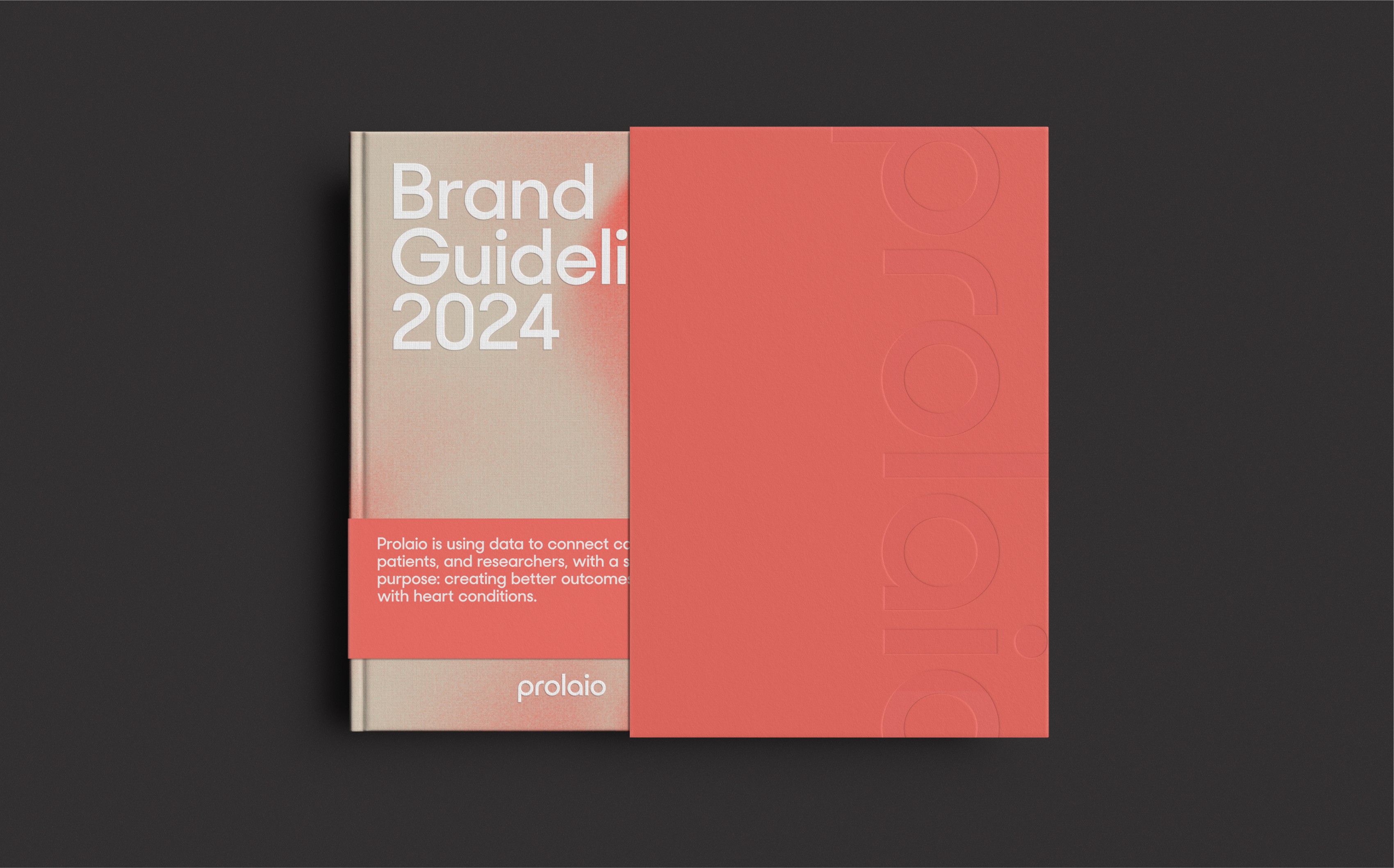
Prolaio
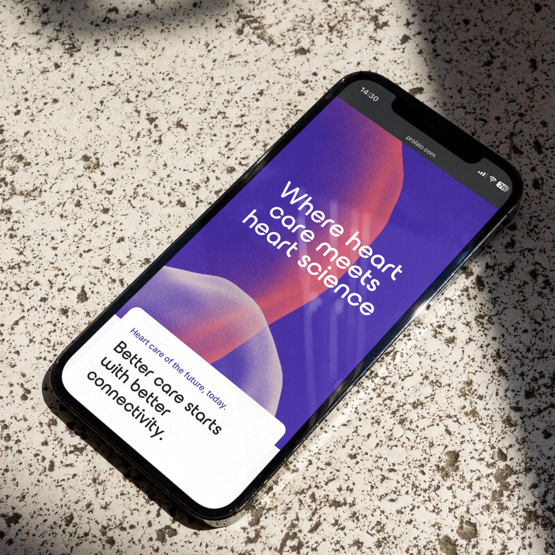
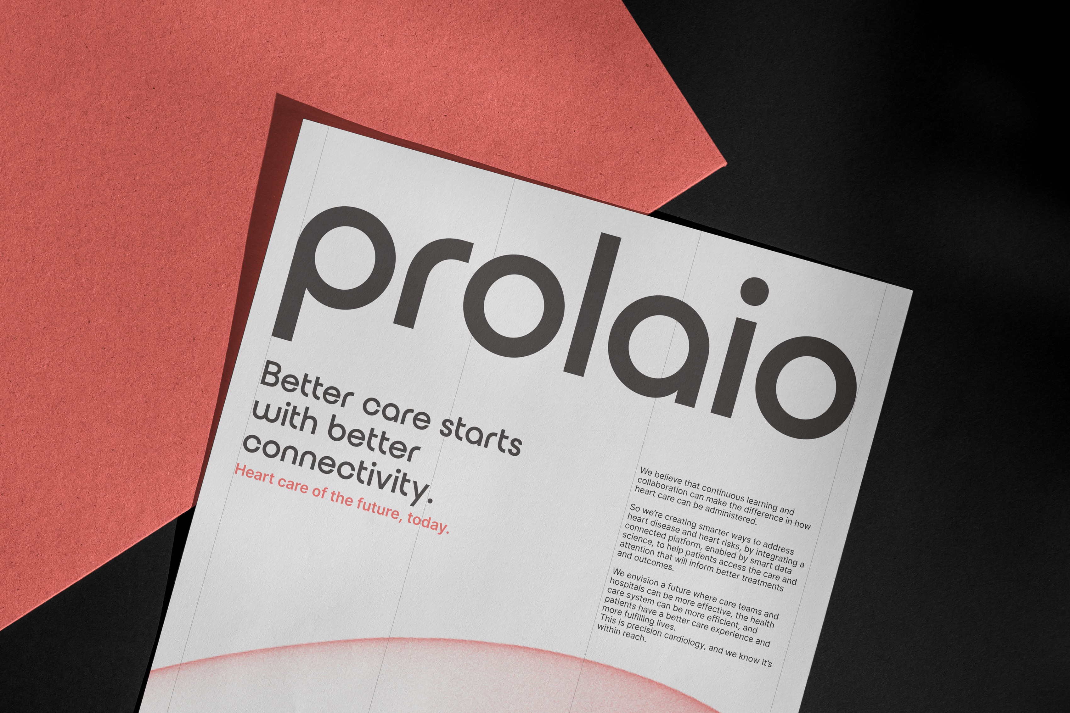
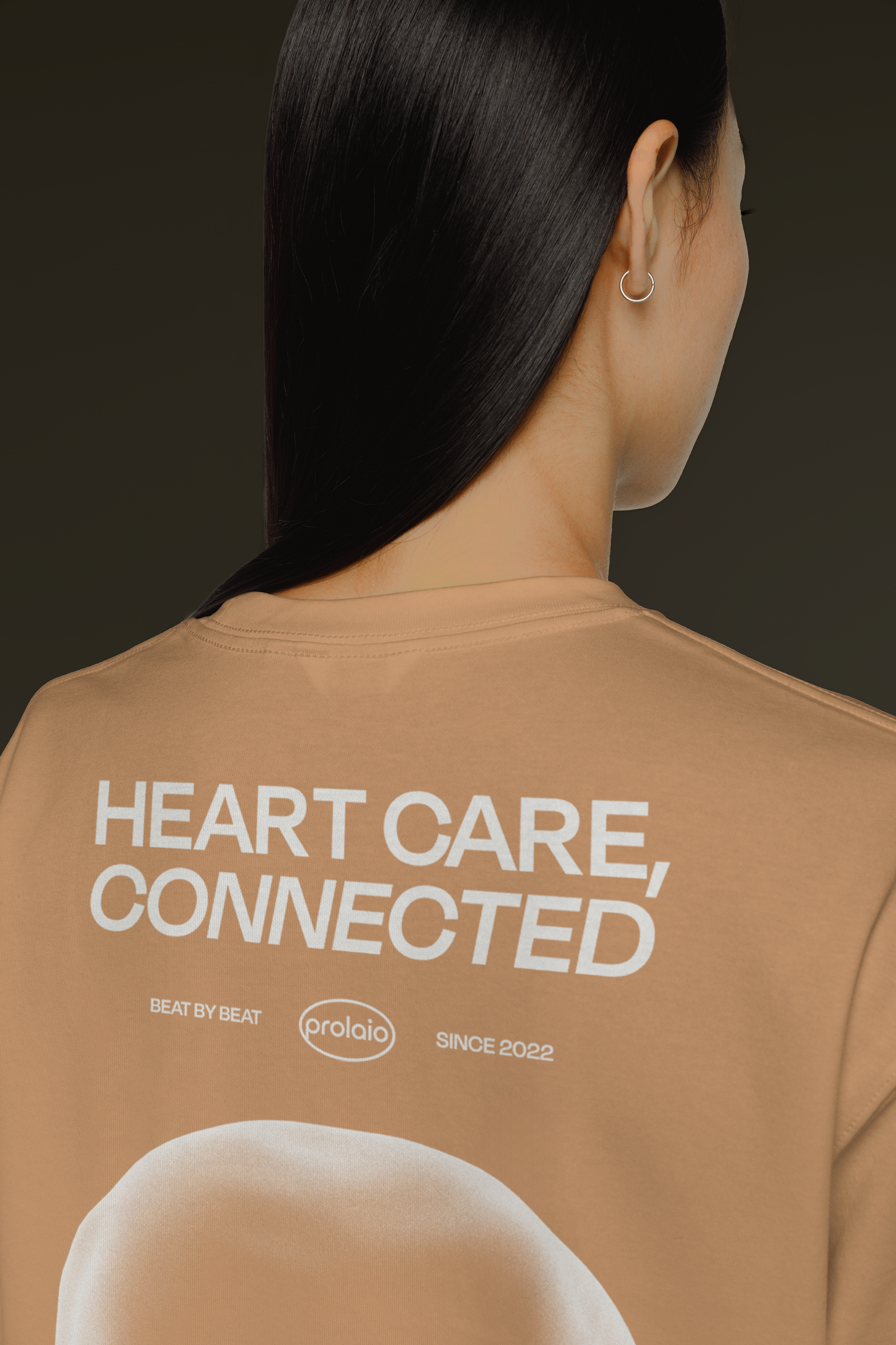
Chances are, you know someone affected by heart disease. Prolaio's mission is to provide relief to those impacted by these widespread issues. Heart care is common, Prolaio’s visual design is anything but. They were determined to stand out from the usual healthcare crowd with a bold, vibrant visual identity—one we were thrilled to help them develop.
Holistic Health
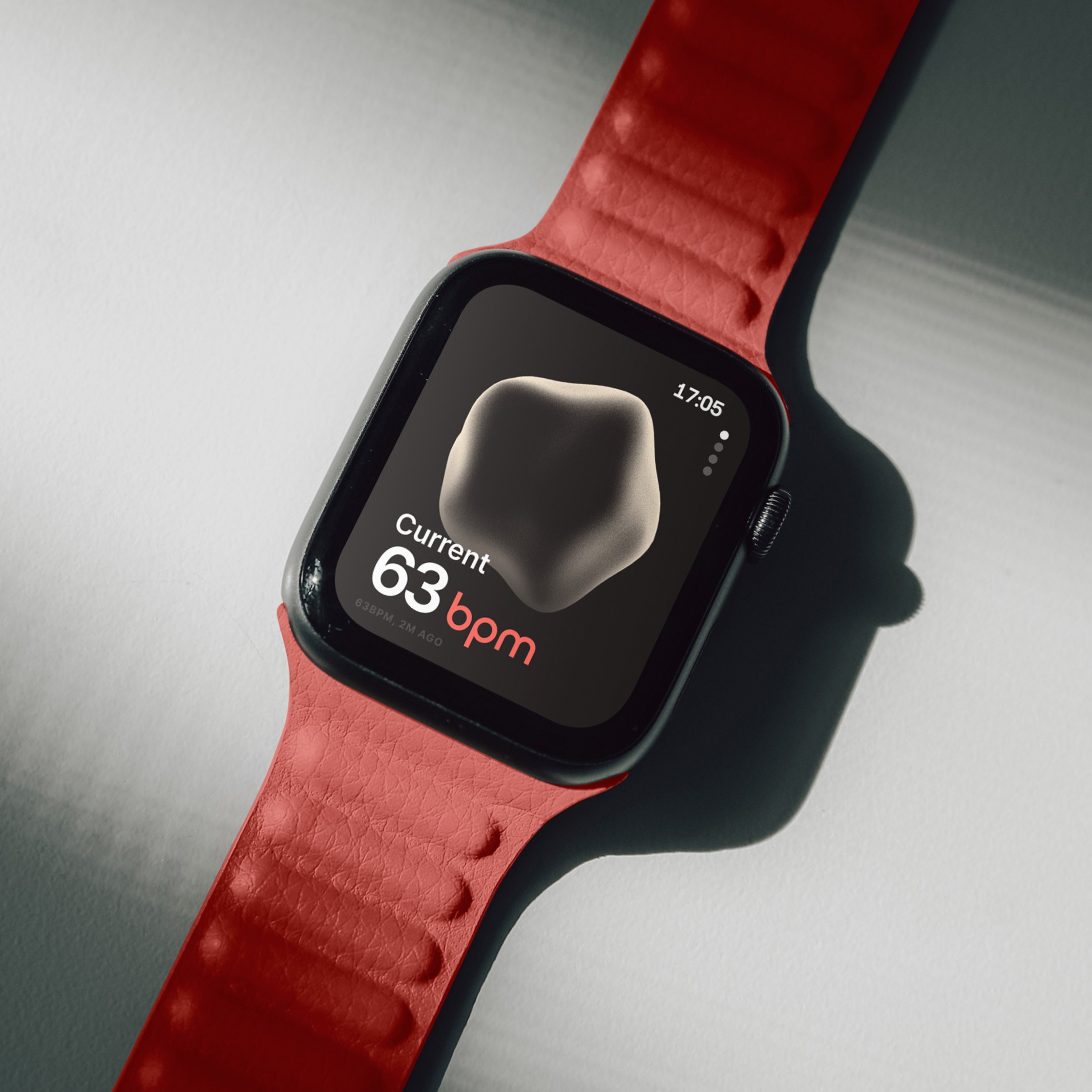
Prolaio’s true magic lies in its ability to leverage real-time data from wearables, providing care teams with the insights they need to anticipate and address health events before they occur. We wanted to create a design system that symbolically represents the "heart"—a beautiful, non-literal portrayal of personal health, encouraging care without inducing fear.
Warm and Welcoming
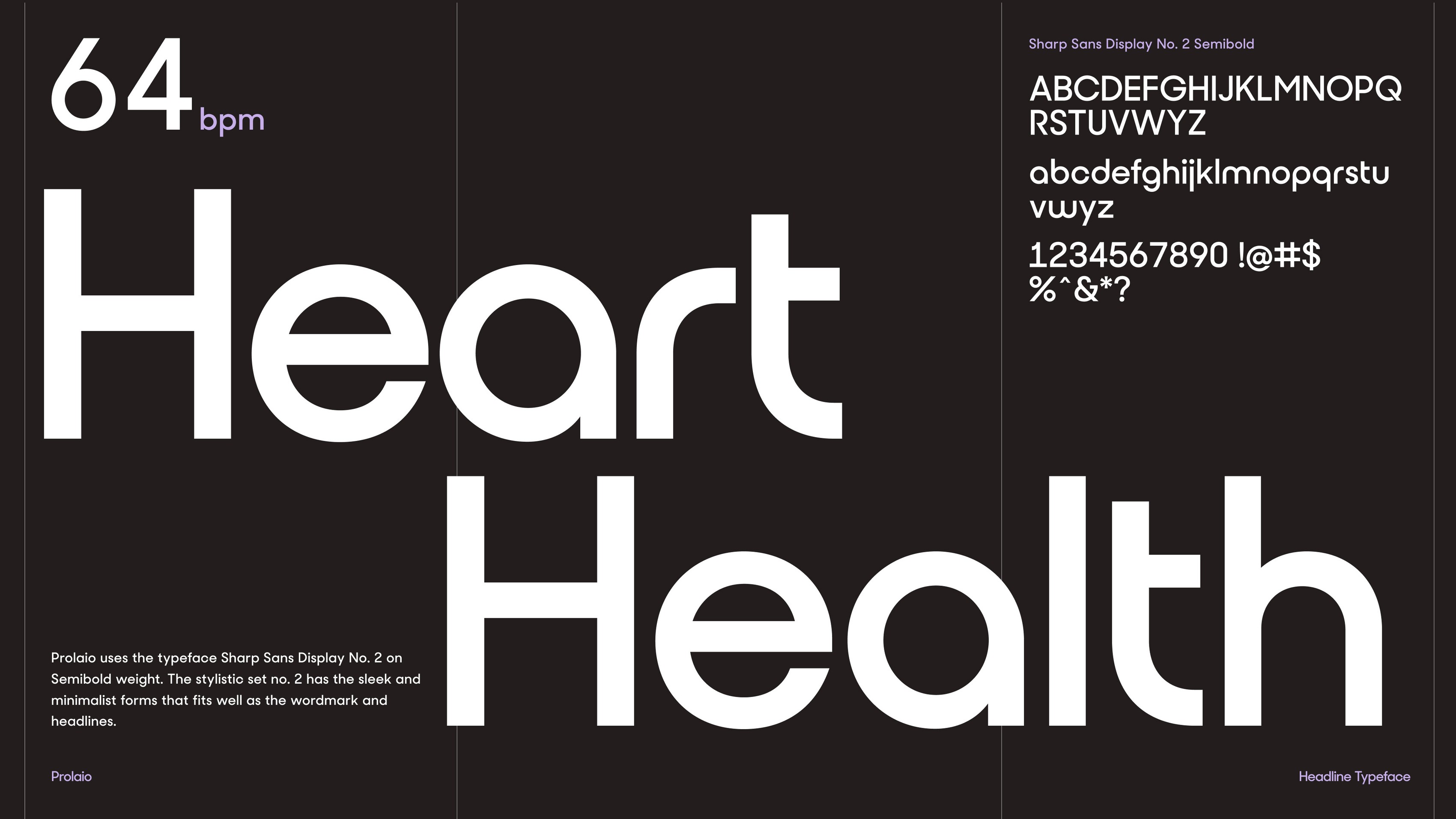
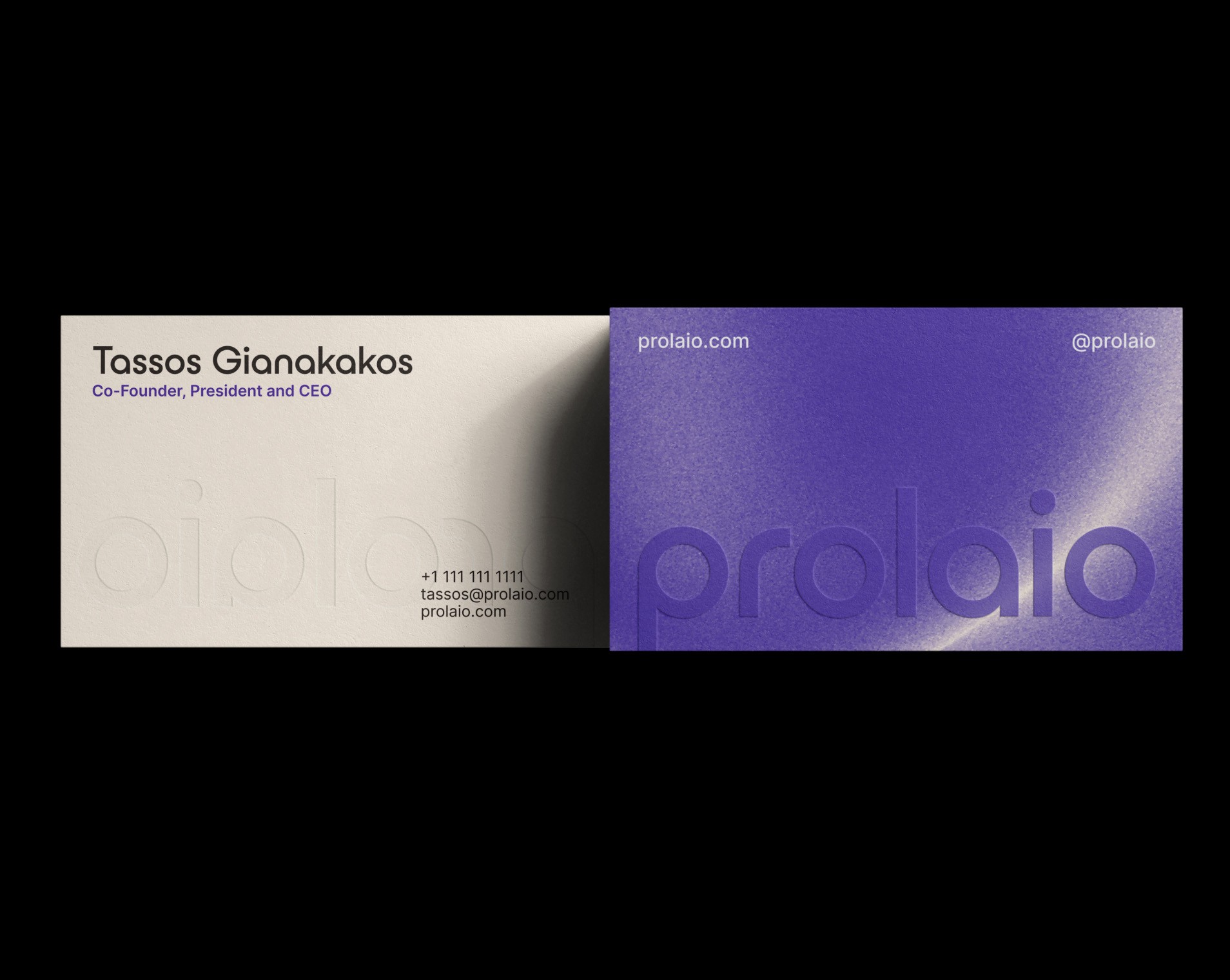
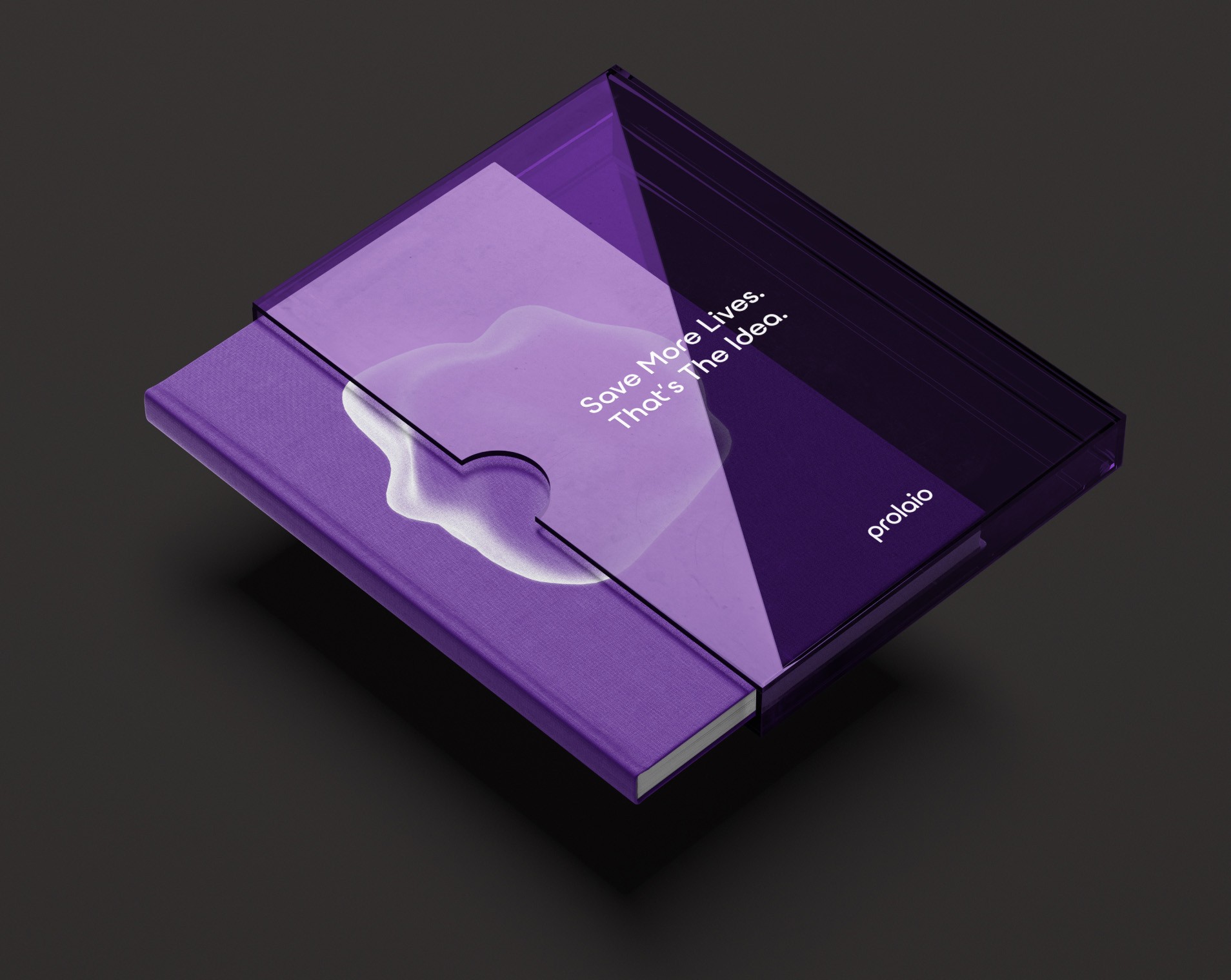
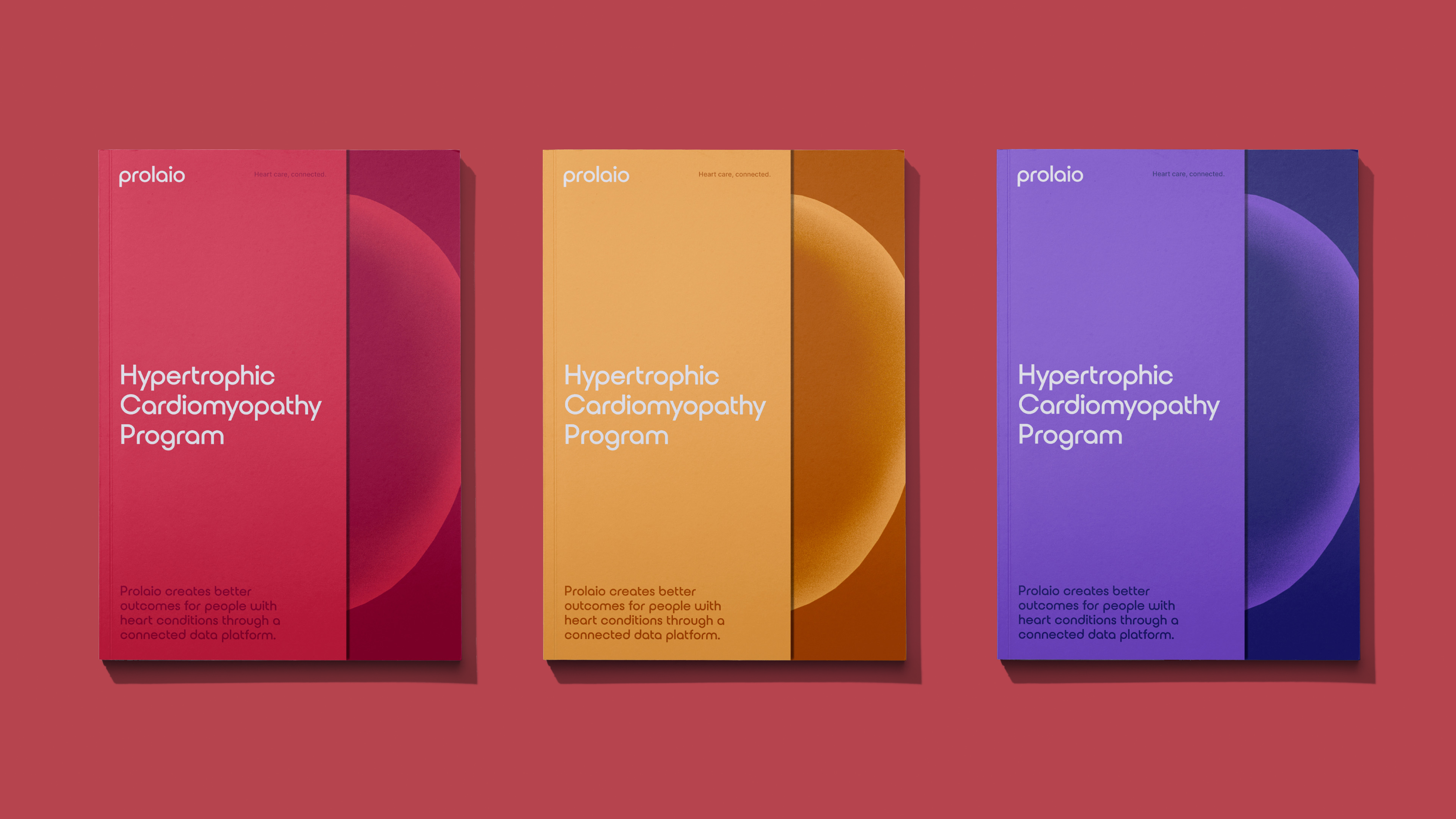
With a welcoming color palette, and a soft yet sturdy hero typeface, Prolaio's new look exudes confidence and freshness, perfectly aligning with a team dedicated to helping as many people as possible.
Client
Prolaio