Space Doctors
About the project
Circuit has been running one of the smartest ideas in transportation since 2011: an affordable, on-demand shuttle service that partners with cities to make getting around easier. Ten million rides and 50+ locations later, the service had outgrown its look. That’s why Circuit came to your friends at TCW for a complete brand update—one that felt less like a pilot program and more like the powerful network connecting cities across the country.
We built Circuit a brand that travels. Get it? It’s a transportation joke. Working across strategy, a complete identity system, and a healthy dose of clever copywriting, we created a unified design system with enough flexibility to feel at home in every community it serves. Wherever Circuit goes, the promise stays the same: a clean, friendly, genuinely local way to get around.

A fleet in motion
We saw an opportunity in Circuit’s fleet to treat every vehicle as the brand’s biggest, most visible touchpoint. A billboard on wheels, if you will. We cooked up a fresh vehicle wrap that’s instantly recognizable from down the street, with some nice little details up close.
Putting Type to Work
Throughout the identity, we use type to bring a bit of personality and movement into the system. Our bold sans-serif headline paired with a library of glyphs gives the Circuit team plenty to play with, while keeping everything recognizably Circuit. These minimal executions are flexible and easy for their in-house team to recreate on the fly.
Photography and Imagery
We saw an opportunity in Circuit’s fleet to treat every vehicle as the brand’s biggest, most visible touchpoint. A billboard on wheels, if you will. We cooked up a fresh vehicle wrap that’s instantly recognizable from down the street, with some nice little details up close.
A fleet in motion
We saw an opportunity in Circuit’s fleet to treat every vehicle as the brand’s biggest, most visible touchpoint. A billboard on wheels, if you will. We cooked up a fresh vehicle wrap that’s instantly recognizable from down the street, with some nice little details up close.
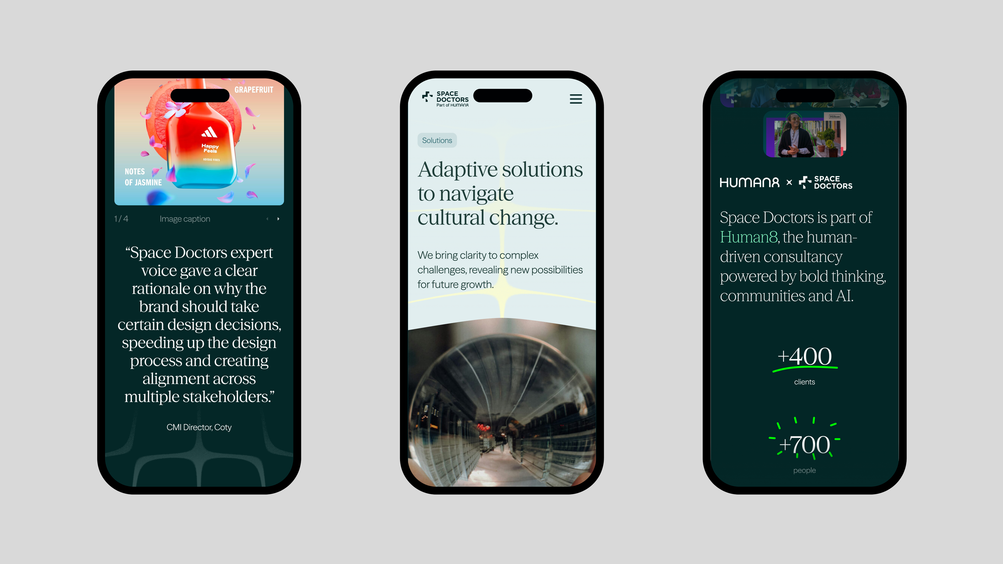
“Agora came to us looking for a unified design system and visual language that could tie together their many products and offerings. They needed something that felt unmistakably Agora, while still flexible enough to move across a wide range of touchpoints.”
Services
Client
Space Doctors